The Global Network for Community Safety Rebrand
The Global Network seeks to improve the quality of community safety by developing a new system for public and emergency services to work together more effectively.
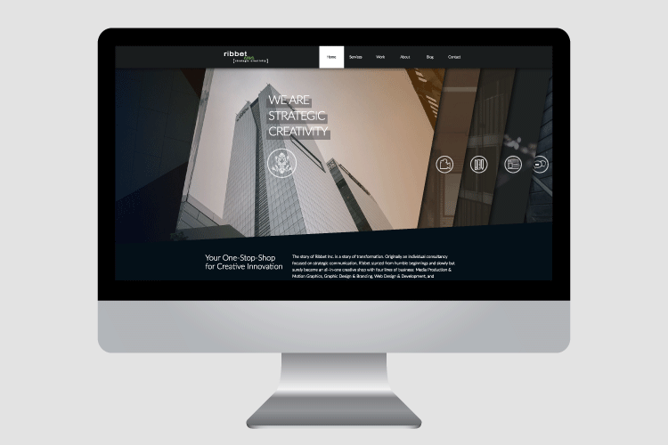
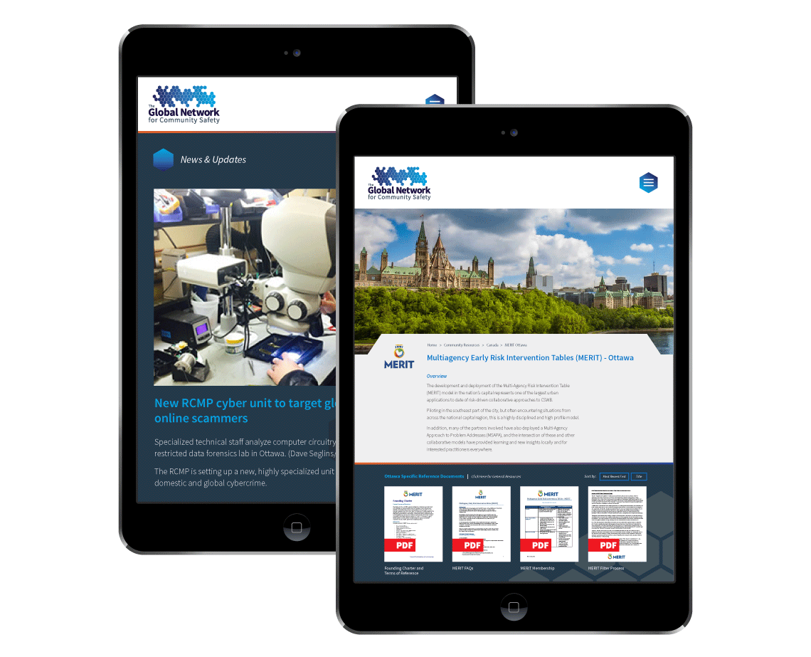
In 2016 the group sought to bolster the image of the company with a rebrand and new website.
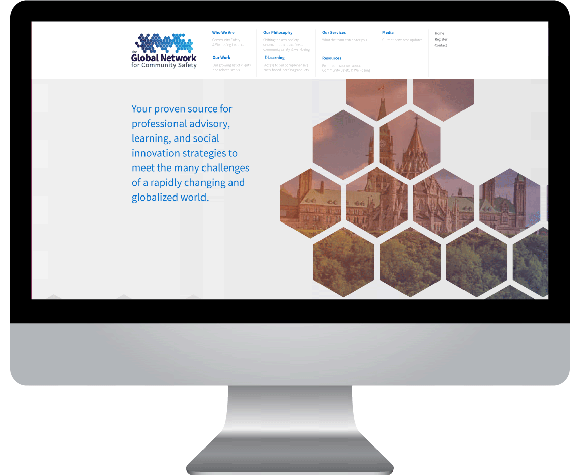
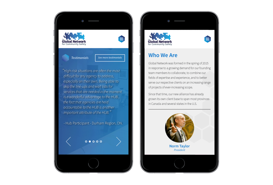
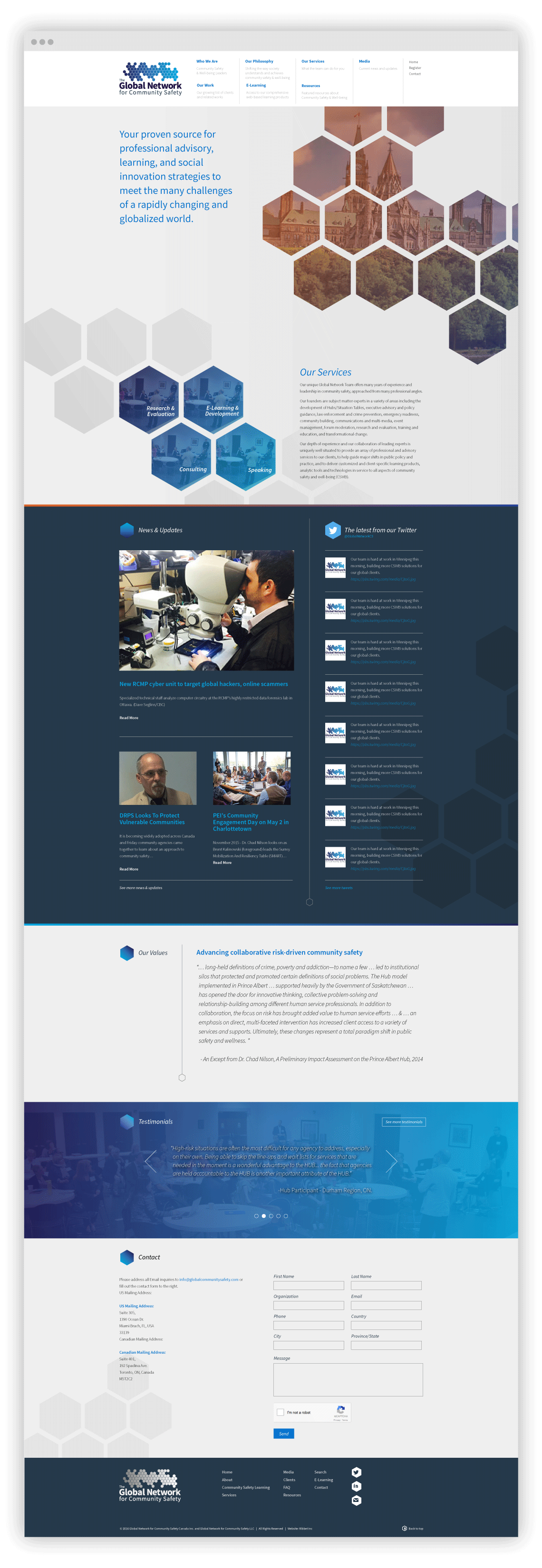
Working closely with the team and Creative Director, we developed a new look and feel for The Global Network that emphasized connection and expertise.
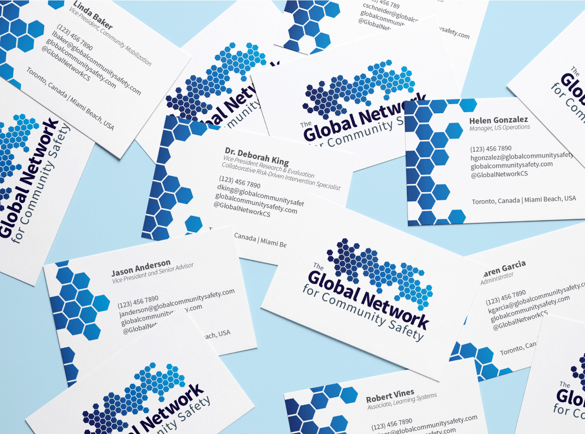
The use of hexagons throughout the branding and website was inspired by the teamwork of honeybees, and by extension, their intricate honeycombs.
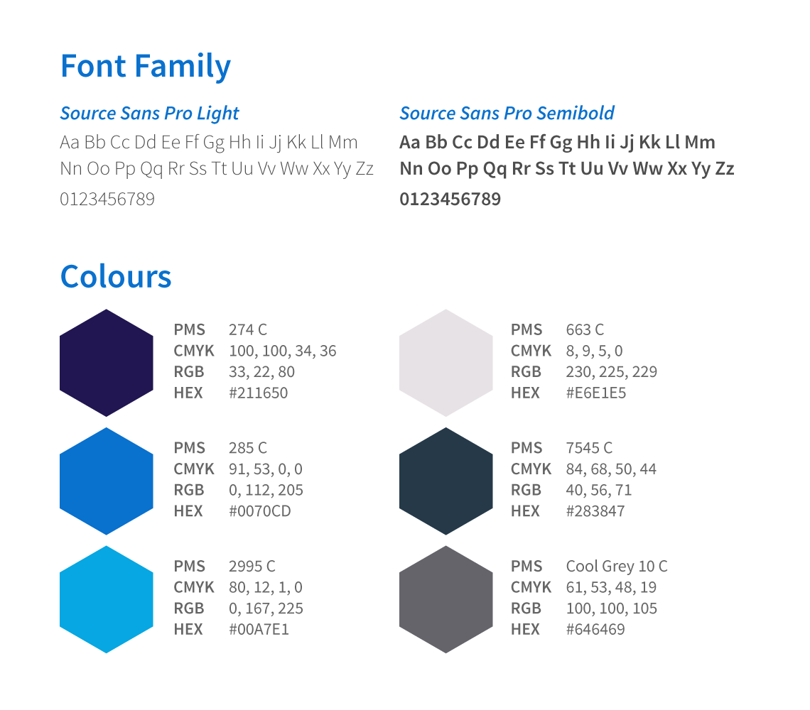
The blue gradient colour scheme was chosen to communicate professionalism, modernity, and trustworthiness to potential clients.

